


Challenge
Design a versatile business card set for different fictional service brands while maintaining strong readability, clear hierarchy, and immediate visual recognition. Each card needed to communicate the character of the brand through typography, composition, and visual identity while remaining practical for real-world use.
Concept
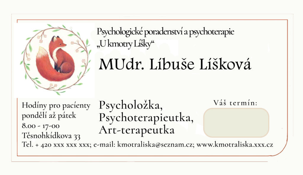
The collection explores multiple approaches to small-format branding — from minimal construction-focused layouts to softer therapeutic aesthetics and bold repair-service identities. Each card uses a distinct visual language tailored to its audience: geometric precision for technical services, clean utilitarian typography for repair businesses, and warm organic illustration for psychological counseling and art therapy.
Result
The final set demonstrates adaptability across different industries and communication styles while preserving strong visual clarity and professional usability. The project highlights skills in logo application, information hierarchy, branding consistency, typography, and print-oriented layout design within compact formats.