

Challenge
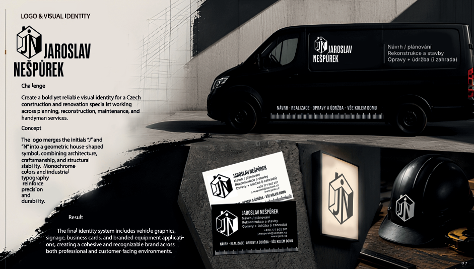
Develop a strong and versatile visual identity for a Czech construction and renovation specialist combining project planning, reconstruction work, maintenance, and handyman services. The branding needed to feel reliable and professional while remaining visually bold and memorable across vehicles, workwear, signage, and business cards.
Concept
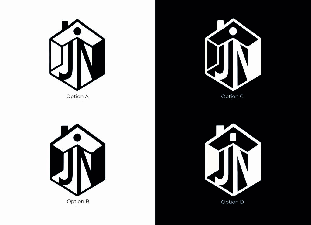
The logo combines the initials “J” and “N” into a geometric house-shaped symbol, visually connecting architecture, craftsmanship, and structural stability. A monochrome palette reinforces durability and clarity, while industrial-inspired typography and layout elements reference technical drawing, construction tools, and precision work.
Result
The final identity system includes logo design, vehicle graphics, business cards, signage, and branded equipment applications. The visual language creates a cohesive and recognizable brand presence suitable for both professional construction services and everyday customer-facing communication.
Challenge
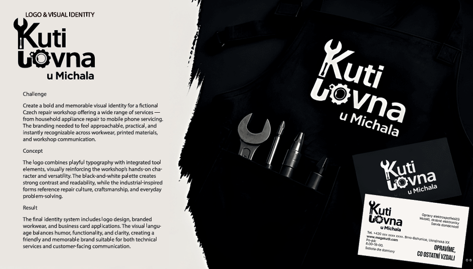
Create a bold and memorable visual identity for a fictional Czech repair workshop offering a wide range of services — from household appliance repair to mobile phone servicing. The branding needed to feel approachable, practical, and instantly recognizable across workwear, printed materials, and workshop communication.
Concept
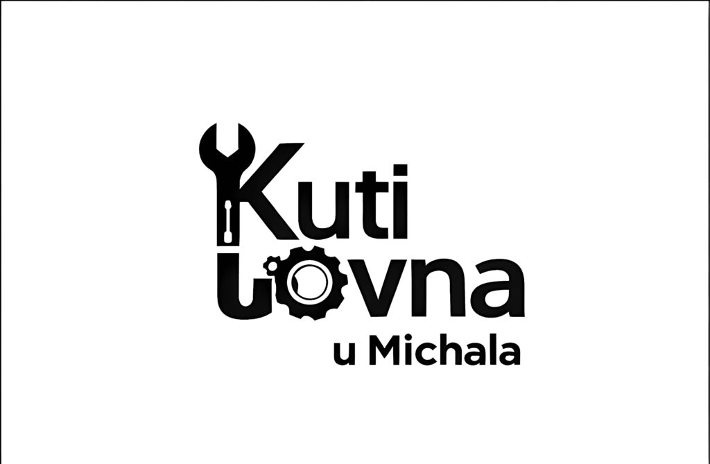
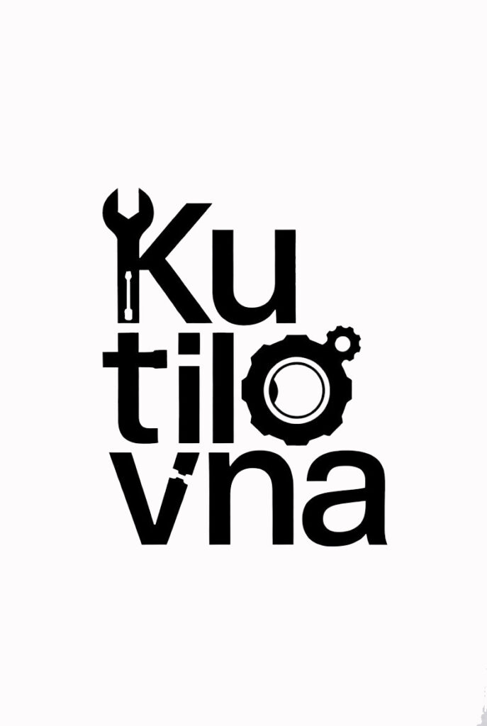
The logo combines playful typography with integrated tool elements, visually reinforcing the workshop’s hands-on character and versatility. The black-and-white palette creates strong contrast and readability, while the industrial-inspired forms reference repair culture, craftsmanship, and everyday problem-solving.
Result
The final identity system includes logo design, branded workwear, and business card applications. The visual language balances humor, functionality, and clarity, creating a friendly and memorable brand suitable for both technical services and customer-facing communication.

Challenge
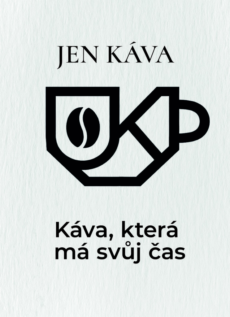
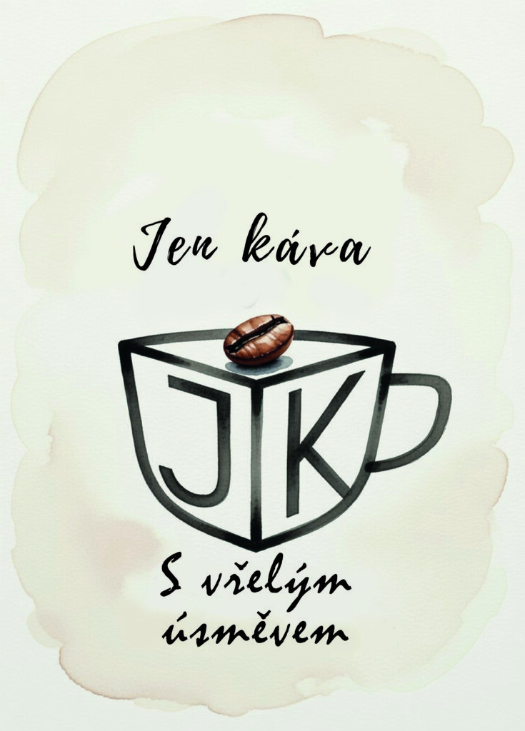
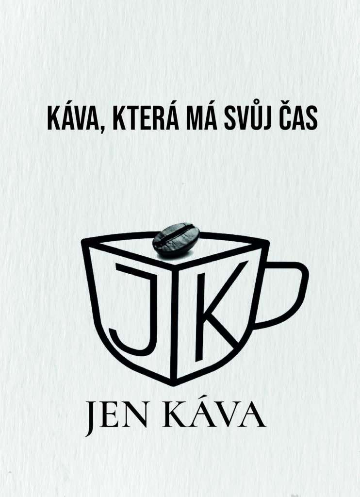
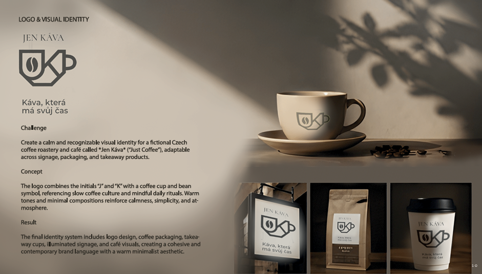
Create a visual identity for a fictional Czech coffee roastery and café called Jen Káva — localized as “Just Coffee.” The branding needed to communicate calmness, authenticity, and quality while remaining elegant, minimal, and adaptable across café signage, takeaway packaging, and product applications.
Concept
The logo combines the initials “J” and “K” with the silhouette of a coffee cup and coffee bean, creating a compact symbol connected to slow coffee culture and mindful daily rituals. Warm neutral tones, soft shadows, and restrained compositions reinforce a feeling of calmness and simplicity. The slogan “Káva, která má svůj čas” (“Coffee that has its own time”) supports the idea of slowing down and enjoying the coffee moment intentionally.
Result
The final identity system includes logo design, takeaway cup applications, coffee bag packaging, illuminated signage concepts, and branded café visuals. The project creates a cohesive and atmospheric visual language balancing contemporary café aesthetics with warmth, minimalism, and recognizable branding.
Challenge
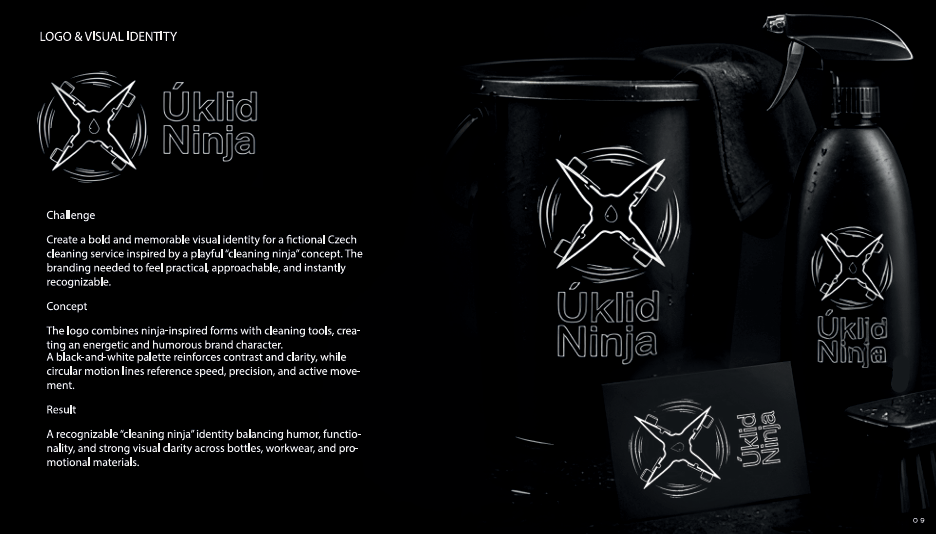
Create a bold and recognizable visual identity for a fictional Czech cleaning service called Úklid Ninja — literally translated as “Cleaning Ninja.” The branding needed to communicate speed, precision, efficiency, and deep-clean professionalism while remaining visually minimal and memorable across cleaning products, uniforms, and printed materials.
Concept
The logo combines cleaning spray bottles into a ninja star symbol, visually connecting household cleaning tools with the idea of ninja-like speed and precision. Circular brushstroke elements reinforce movement and energy, while the monochrome palette creates a sleek, stealth-inspired aesthetic associated with cleanliness and efficiency.
Result
The final identity system includes logo design, branded cleaning product packaging, bucket and accessory applications, and business card concepts. The project balances playful branding with strong visual clarity, creating a modern and memorable identity suitable for both residential and professional cleaning services.