


Challenge
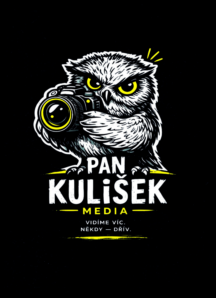
Create a mascot-based visual identity for a fictional media platform capable of functioning across digital branding, merchandise, social media, and promotional materials. The identity needed to feel memorable, expressive, and adaptable while preserving strong silhouette readability and mascot personality.
Concept
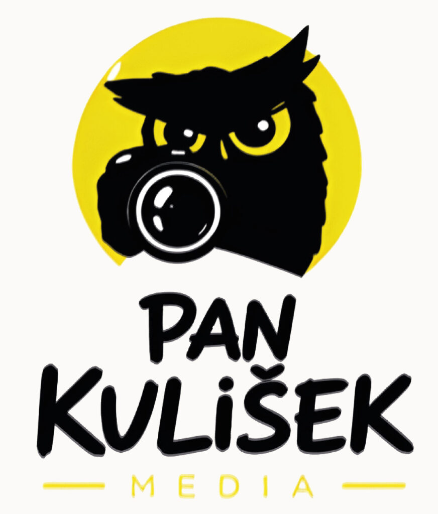
The project is based on an original authorial illustration of an owl photographer named Pan Kulišek. In Czech, the name references both a small owl and the photographic term “kulisek” associated with framing and visual observation, reinforcing the media and photography theme. The mascot combines humor, vigilance, and journalistic curiosity through exaggerated eyes, dynamic linework, and a camera integrated directly into the character design. The black-and-yellow palette strengthens visibility and creates strong contrast suitable for media branding.
Result
The final identity system includes mascot illustration, logo variations, icon development, merchandise applications, hoodie branding, stickers, and social media-ready assets. The project demonstrates how an original illustrated character can evolve into a flexible and recognizable visual identity for a contemporary media platform.

Challenge
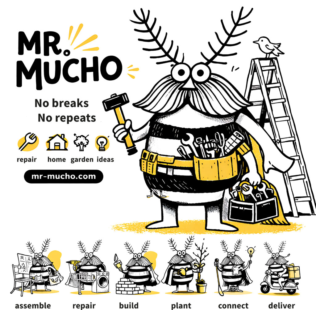
Create a mascot-driven identity for a fictional service aggregator capable of connecting users with practical everyday help — from repairs and assembly work to emergency assistance, pet care, delivery, and household support. The branding needed to feel humorous, approachable, and highly adaptable across digital platforms, applications, and promotional materials.
Concept
The mascot Mr. Mucho references the Spanish word “mucho” (“a lot” / “many”), emphasizing versatility and the ability to solve many different problems through one platform. The character combines handyman aesthetics with exaggerated cartoon features, transforming reliability and practical assistance into a memorable visual personality. The black-and-yellow palette reinforces visibility and energy, while modular mascot poses communicate different service categories in a playful and intuitive way.
Result
The final identity system includes mascot design, logo development, service-category illustrations, app-ready icons, promotional visuals, and branding applications. The project demonstrates how character-driven branding can make practical digital services feel more human, accessible, and emotionally engaging.
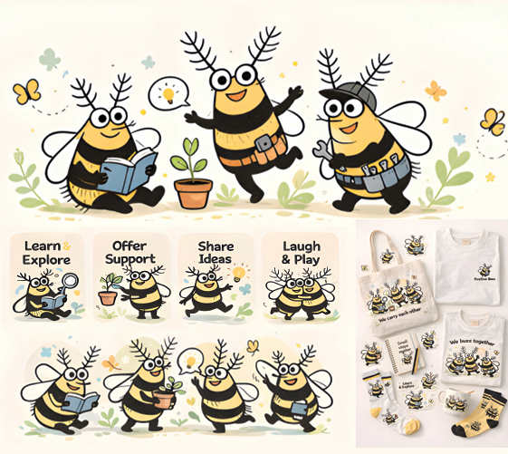
Challenge
Create a collective mascot system for a fictional educational platform focused on creativity, curiosity, emotional support, and collaborative learning. The identity needed to feel friendly, inclusive, and highly adaptable across educational materials, merchandise, digital platforms, and community communication.
Concept
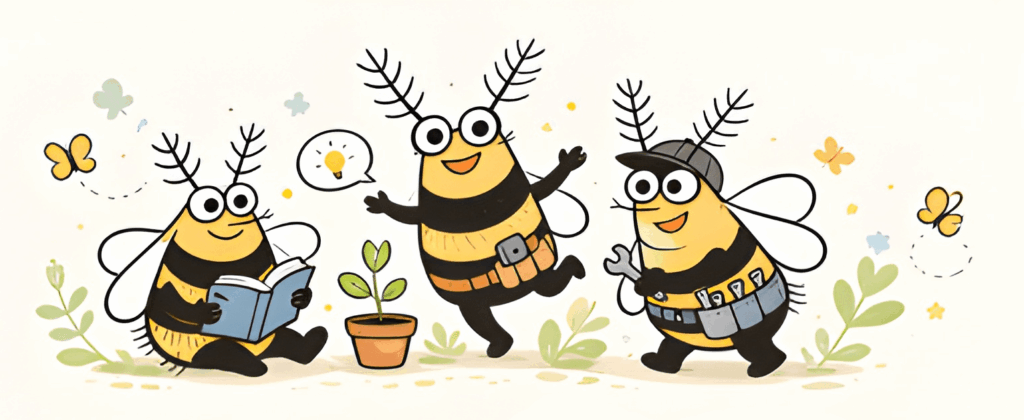
The project uses positive bumblebees — intentionally not honeybees — as symbols of curiosity, teamwork, gentleness, and playful learning. Each character represents a different type of activity: exploring, sharing ideas, supporting others, reading, creating, and collaborative play. Soft hand-drawn illustration, warm yellow tones, and rounded forms create an emotionally safe and approachable visual atmosphere suitable for both children and family-oriented educational environments.
Result
The final identity system includes mascot variations, educational icons, scene illustrations, merchandise concepts, apparel applications, stationery, and community-focused branding assets. The project demonstrates how character-driven illustration can build an emotionally engaging and flexible identity system for contemporary educational platforms and creative communities.